Emblem |
Details |
|
1932
Los Angeles
This
is the first time It in the history of the Olympic
Summer Games and emblem is used by the Olympic
Organizing Committee. It is composed of the American
flag presented in the form of arms, accompanied
in the foreground by the Olympic rings, the Olympic
motto "Citius, Altius, Fortius" (faster,
higher, stronger) and a laurel branch, symbol of
victory. |
|
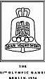
1936
Berlin
The emblem was created purely by chance. An artist, Johannes
Boehland, started by designing an emblem containing the
five Olympic rings with a superimposed eagle and the
Brandenburg Gate, one of the symbols of the city. However,
the President of the Games Organizing Committee, Dr Lewald,
was not satisfied with this composition and took the
initiative to open the bottom part of the emblem, which
turned the design into a bell. Although it was purely
by chance that it was created, the symbolism of this
figure was immediately recognized. On the side of the
bell is the inscription
“Ich rufe die Jugend der Welt!” (I call the
youth of the world). The artist was commissioned to continue
designing the emblem on this theme. The definitive emblem
was thus composed of the Olympic bell on which can be
found the Olympic rings with the German eagle superimposed.
As well as the Olympic rings, flame and oath, the bell
became one of the strong and omnipresent symbols of the
Berlin Games. |
|
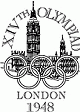
1948
London
This
emblem is composed of the clock tower of the Houses
of Parliament. The hands of the famous "Big
Ben" are pointing to 4 o'clock, the time at
which the opening of the Games was planned. In
the foreground, the Olympic rings. The Games Organizing
Committee wanted a typically English emblem. One
that would have significance not only for the generation
of that time but for future generations as well. |
|
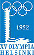
1952
Helsinki
The emblem was composed of the tower of the stadium with
the Olympic rings at the top. It was worn as a badge
by the dignitaries and VIP guests at the Games. |
|
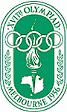
1956
Melbourne/Stockholm
The
emblem for these Olympic Games is composed of a
drawing of Australia, with a torch and Olympic
rings superimposed. In the bottom half, the inscription "MELBOURNE
1956", extended on each side by laurel branches. |
|
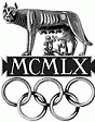
1960
Rome
The emblem of these Olympic Summer Games is made up of
the Olympic rings above a Roman she-wolf from which Remus
and Romulus are suckling. They are the twin brothers
who, according to legend, founded the city of Rome. Between
them is the date, 1960, written in roman numerals. |
|
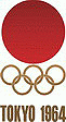
1964
Tokyo
It is composed of the Olympic rings superimposed on the
emblem of the Japanese national flag, representing the
rising sun. Having examined a large number of proposals,
the Games Organizing Committee chose the design submitted
by Yusaku Kamekura which was subsequently accepted as
the official emblem of the Games. |
|
1968
Mexico
The Summer Games emblem is a combination of the five
Olympic rings and the year. The design came from the
collaboration of three artists: Pedro Ramirez Vazquez,
architect and President of the Organizing Committee for
the Games, Eduardo Terrazas (Mexico) and Lance Wyman
(USA). It recalls the patterns of the Huichole Indians. |
|
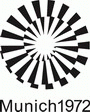
1972
Munchen
It represents a crown of rays of light, a design symbolizing
the spirit of the Munich Games: light, freshness, generosity,
expressed by the design “Radiant Munich”.
It was created by Otl Aicher, the designer and director
of the visual conception commission. His project was
chosen in spite of a competition whose 2.332 entries
were unsatisfactory. |
|
1976
Montreal
The emblem is made up of the Olympic rings mounted on
an Olympic podium which is also the graphic interpretation
of the letter M, the initial of Montreal. In the centre,
the athletics track, the focal point of the Games. This
emblem invokes the universal fraternity offered by the
Olympic Ideal as well as the glory of the winners, the
gallant spirit of their battles and the accession of
Montreal to the rank of Olympic city. |
|
1980
Moscow
The official emblem was created by Vladimir Arsentyev.
Above the Olympic rings there are parallel lines in the
shape of a pyramid and a five pointed star which serves
as a reminder of the flag of the Kremlin. |
|
1984
Los Angeles
The star is a universal symbol of the highest aspirations
of mankind, the horizontal bars portray the speed with
which the contestants pursue the excellence while the
repetition of the star shape connotes the spirit of competition
between equally outstanding physical forms. The symbol
colors - blue, white and red - were in part chosen for
their traditional significance in the awarding of prizes
for first, second and third place. |
|
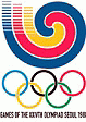
1988
Seoul
The Seoul emblem features a samtaeguk pattern. A samtaeguk
is a traditional Korean pattern and visual image which
represents Korea. This pattern is widely used as decoration
on fans, gates of Korean-style homes, artifacts, and
folk crafts. The Olympic emblem features patterns in
two forms, centripetal and centrifugal; the centripetal
motion represented the people of the world coming together
in Korea, thus symbolizing worldwide harmony, while the
centrifugal motion represented a march onward in search
of man’s lasting happiness and prosperity. |
|
1992
Barcelona
The official emblem, designed by Josep Maria Trias from
Barcelona, depicted a dynamic human figure in a stance
that suggested someone jumping an obstacle which consisted
of the five Olympic rings and the simple, gestual lines
reduced the characterization of the figure to the head
(in the blue of the Mediterranean), the arms (the yellow
of the sun and wide open in sign of hospitality) and
the legs (a vivid red). |
|
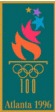
1996
Atlanta
The base of the torch, made of the five Rings and the
number 100, resembles a classical Greek column and recognizes
the centennial of the Games. The torch's flames gradually
evolve into a perfect star symbolizing each athlete's
pursuit of excellence. The gold color in this logo represents
gold medals. The green represents laurel branches worn
by winners in ancient times, as well as Atlanta's reputation
as the City of Trees. |
|
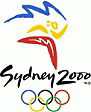
2000
Sydney
The emblem represents the figure of an athlete, using
typically Australian shapes and colors. The boomerangs
and suggestions of sun and rocks together with the colors
of the harbor, beaches and red interior, invoke the unique
Australian landscape and its original inhabitants. The
flash which transforms the silhouette of Sydney Opera
House into a trail of smoke from an Olympic torch recalls
the emblem of Sydney’s Olympic candidature. |
|
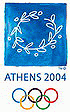
2004
Athens
The 2004 Olympic Games emblem is a wreath made from an
olive tree branch or kotinos. The emblem is a reference
to the ancient Olympic Games where the kotinos was the
official award of Olympic champions. In addition, the
olive was the sacred tree of Athens. The colors of the
emblem symbolize the shades of white and blue found in
the Greek countryside. |
|
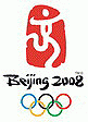
2008
Beijing
The
official emblem of Beijing 2008 entitled "Chinese
Seal-Dancing Beijing" cleverly combines the
Chinese seal and the art of calligraphy with sporting
features transforming the elements into a human
figure running forward and embracing triumph. The
figure resembles the Chinese character "Jing",
which stands for the name of the host city and
represents a particularly significant Chinese style.
The artwork embodies four messages: • Chinese
culture • the color of red China • Beijing
welcomes friends from all over the world • to
challenge the extreme, achieve perfection and promote
the Olympic motto of "Citius, Altius, Fortius"
(faster, higher, stronger).
|
|
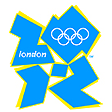
2012
London
The
London 2012 emblem combines the power of the Olympic
rings and the city of London together. The emblem
is the number 2012. It is universal and understandable
worldwide. The emblem is simple, distinct, bold
and buzzing with energy. Its form is inclusive
yet consistent and has incredible flexibility to
encourage access and participation. It can communicate
with anyone from commercial organisations to kids
playing sport. It feels young in spirit, full of
confidence, certainty and opportunity, not afraid
to shake things up, to challenge the accepted,
to change things. For the first time, the Olympic
and Paralympic Games will be part of the same brand
family. |